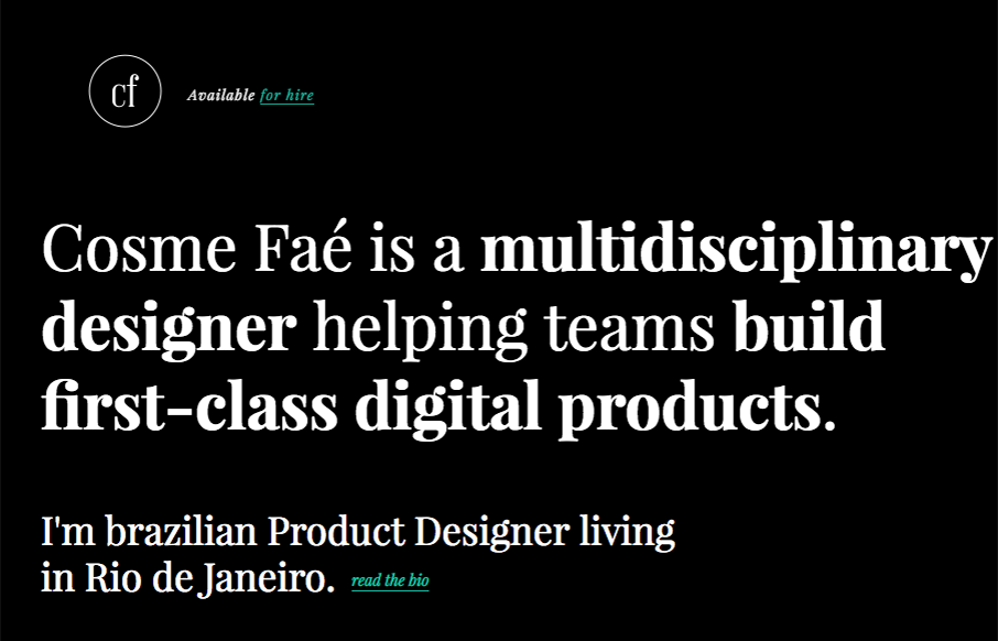
I like the dark background used here, the typography in the top portion of the page is solid too. Haven’t seen that in a bit, that mixed withe the asymmetrical intro of all the images makes for a cool vibe. Thorough case study pages give you plenty of great content to get deeper into the company’s abilities too.
Looking Fast: The Art of Website Speed Perception
In the web world, technical speed and user perception matter. By improving design for a faster appearance, you boost conversions and stand out online. Speed isn’t just loading time; it’s perception.


0 Comments