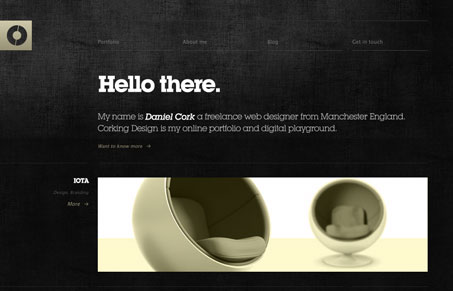
Submitted by Daniel Cork, @corkingdesign. Designer & Developer.
Love this dark background website. It’s nice and simple and the texture really makes it stand out. I also like the portfolio layout and how it all comes together in a rather simple non-obtrusive way. Some of the gray text on dark background is hard to read, mostly because of the size of the font I think, but overall the effect of this design is nice.


I like the design, the texter on the background is easy on the eyes. The navigation could use some work, more well define. Make it stand out a little. Over all it well design.