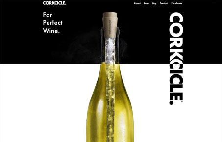
My first impression of corkcicle.com is a stark and minimalist image ad but thats a somewhat incomplete assessment. This single page scroller goes to pretty great lengths to provide a rich visual experience. The initial scrolling experience is something to behold. I actually like the way that the effect works on the vertical Corkcicle logo more that the bottle but its a novel way to visually “slice” a bottle in half. The one detail that really caught my eye is the blurred vine near the bottom of the page. It actually overlays content but just slightly and the contrast between the blurred image and the sharply focused text is a nice visual experience.


Not to mention the parallax effect with the vine. A lot of detail put into this little site, I saw it a few weeks ago and loved it!
I particularly like the point in scrolling when you finish off the bottle and that next section scrolls up.
I like the bit where they became the 300th websites to copy nikebetterworld
The vertical parallax thing was being done way before NikeBetterWorld man.
First impression great! But I dont think its good for a wine to put a plastic thing on it inside. It will ruin the flawours totally! Especially for a 80-100 usd vine…. I dont want that!
As wino’s, the creators of CORKCICLE made sure to select a material that would not alter the taste and flavor of the wine…that would be tragic!
The materials are handpick to do their job of cooling only…and not react or absorb into the wine at all. Cheers!