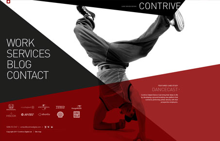
This site makes a striking first impression. The bold red and the crossing lines and angular shapes make for a dynamic look. The black and white photos work well and each ‘page’ is different and interesting. Some of the pages work better than others, however. The showcase page serves up a grid of of work and is easy to navigate. The services page separates all of its content into each compartment, making it hard for my eye to know where to land, since each bit is so spread out. One minor issue is that the main font used is often too light and small, making it hard to read. It’s also using cufon to render the fonts. While there’s nothing ‘wrong’ with this, it’s really an outdated thing to be using. The main font looks a bit like DIN, which is available from FontFont. That said, this is still an interesting and experimental site.
Microinteractions
Microinteractions are subtle site animations enhancing engagement. They include triggers, rules, feedback, and sometimes loops/modes. Practical uses: improving engagement, guiding user behavior. Well-designed microinteractions boost user engagement and your online presence.


0 Comments