via @wyattdanger
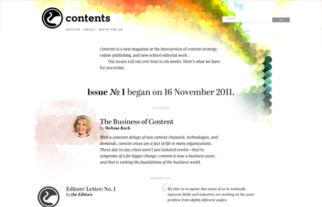
“Great web design, an excellent example of mobile first: @contents contentsmagazine.net”
Contentsmagazine.net is a great example of design that is loosely structured but still successful. The design is very whitespace heavy and content rich, with very little designer fluff in the way. Its entirely responsive and doesn’t feel awkward at any size. Sweet.


0 Comments