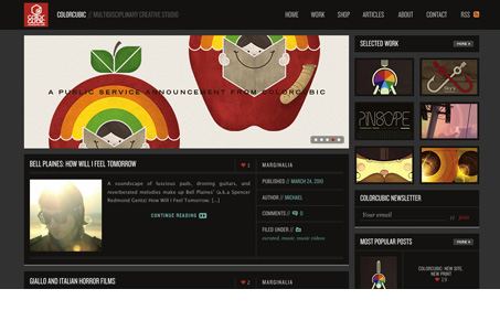
I love the feeling of this design, the blocky nature and the dark background colors work really well together to make up this experience. The fixed header and other interaction details are also nicely done and subtle.
Looking Fast: The Art of Website Speed Perception
In the web world, technical speed and user perception matter. By improving design for a faster appearance, you boost conversions and stand out online. Speed isn’t just loading time; it’s perception.


I love, love, love the content of this site. There’s so much cool shit on each and every post. There’s obviously a deep affinity for the colors and technology of the late 60’s and 70’s. The oranges and yellows and browns that dominate a lot of the posts add a real richness. I do find the type a bit hard to read sometimes, though. There’s not enough contrast and the condensed fonts sometimes are too small.