
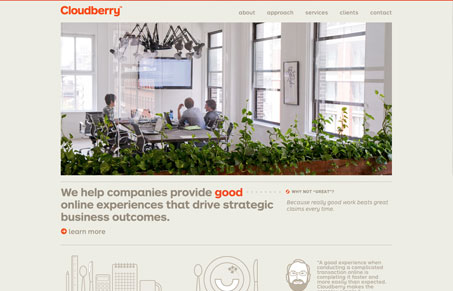
Given that this is a website for a User Experience Design Consultancy the website has to be super crisp and exact and also precise feeling. They deliver on all those with ease. I like the clean easy going typography matched up with some super neat illustrations. Love this site!




This site is exemplary in that it practices what it preaches. The site looks like Ikea so there is a definite personality immediately expressed. The site seems to demonstrate that it’s a team as opposed to a single person and that gives it credibility. In contrast to many of the independent web designer sites, it’s nice but not over the top. It’s beautiful and inspiring yet safe. It’s clean and professional and as a business owner the type of company that inspires credibility and trust as a result. Many designer sites are cool but don’t inspire confidence because they’re so outside the box one worries they will frighten away the target audience and cannot do “normal”.