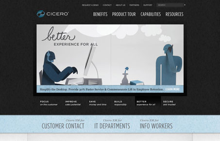
This website is absolutely beautiful. Those illustrations that as far as Giovanni and I can tell are hand made and photographed. Just fantastic. The site is broken up into two large halves basically, the top is dark and contains some nice imagery and beautifully executed typography then the lower section is more functional content wise, serving up screenshots and other types of imagery.
Check out the screen cast review for a more in-depth walk through.
The sub pages while all basically the same layout are also very well done. I love the sidebar design with the tab look and torn folder paper feel. Overall we had the feeling that we couldn’t quite figure out what this company was all about though. We think the content isn’t direct enough to communicate quickly what they do, is it service or product? The presentation is so beautiful, sharpening up the story it tells could make this one of the great sites on the internet.


0 Comments