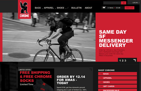
Really cool blocky feel to this design. I love all the squared off elements and the rich red/black coloring of the site.
Glassmorphism: The Transparent Design Trend That Refuses to Fade
Glassmorphism brings transparency, depth, and light back into modern UI. Learn how this “frosted glass” design trend enhances hierarchy, focus, and atmosphere, plus how to implement it in CSS responsibly.


Who needs round corners and gradients? Not this site, which is why I like it. The greys look great and help the red stand out without being overwhelming. The red itself is slightly muted, so it doesn’t hurt your eyes.
The slider in the masthead of the homepage seems to beak in Opera (my weapon of choice), though. The occasional red-on-red paragraphs are hard to read as well. Otherwise the design is inspiring for me.