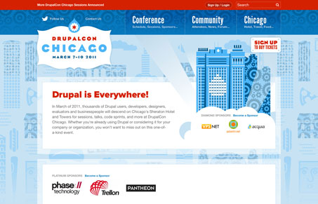
The DrupalCon Chicago website is a wonderful mixture of illustration and solid layout. Almost every detail in the illustrations represent Chicago and Drupal Dev, very clever looing. I really like the line work on everything, the shapes/boxes match up perfectly with all the art. The colors are very bold and fitting. I like the dropdown designs too on the main navigation and the sub pages, while all pretty much the same layout don’t bore you out as you go through the site. Really solid work here.


Awesome site
Gee, thanks for the nice compliments Gene! I am going to pass this review along to the rest of the team.