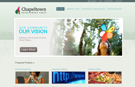
Really great color palette, I love the subtle green/gray hues here. The large central image over the 3 column grid is a classic layout and done well here with just being clean and precise. The typography of the content areas might be a little too simplified, I feel like if a more non-standard typeface were used it would really make this design rock, as it is now it’s good but that simple difference could make it great.
Looking Fast: The Art of Website Speed Perception
In the web world, technical speed and user perception matter. By improving design for a faster appearance, you boost conversions and stand out online. Speed isn’t just loading time; it’s perception.


0 Comments