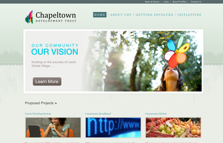
Really great color palette, I love the subtle green/gray hues here. The large central image over the 3 column grid is a classic layout and done well here with just being clean and precise. The typography of the content areas might be a little too simplified, I feel like if a more non-standard typeface were used it would really make this design rock, as it is now it’s good but that simple difference could make it great.
Glassmorphism: The Transparent Design Trend That Refuses to Fade
Glassmorphism brings transparency, depth, and light back into modern UI. Learn how this “frosted glass” design trend enhances hierarchy, focus, and atmosphere, plus how to implement it in CSS responsibly.


0 Comments