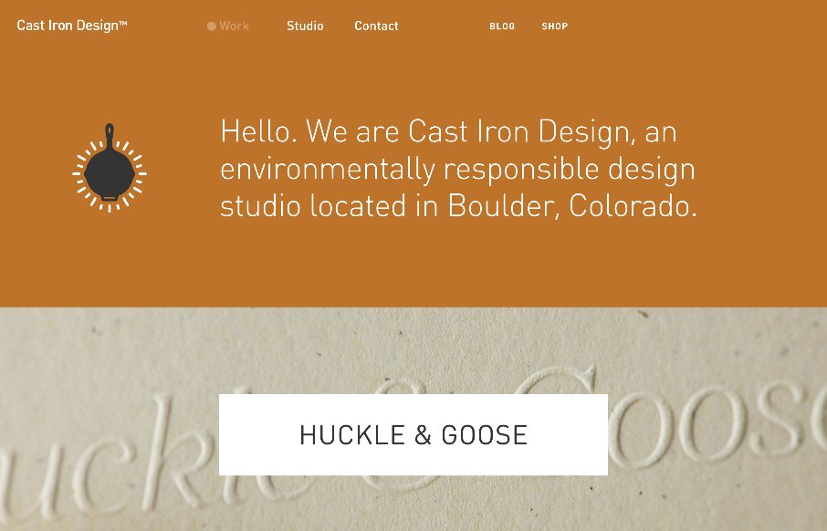
Man – this is some sweet work from Cast Iron Design out of Boulder, Colorado. After going back through the site, I almost made this a Friday in-depth review. They go straight to the heart of showing off their work on the home page, using this trend of background image portfolio list – but it’s the execution to the work detail page that is really good. Scroll down to “Roger the Barber” and click it – the banner image slides up into place, and you get the allusion that you’re on the same page, but the rest of the page changes out below, as the sticky header slides in on top. Also like the work detail pages themselves, as well as the attention paid on the Contact area, with the three different forms, addressing three different audiences (trying to figure out a similar issue on a site we’re working on here). Smooth all the way around.
From the Designer: We built our portfolio site with a focus on prominently showcasing the photos of our work. The images are large and responsive, and the design is primarily typographic. We added subtle animations throughout to create a smooth and engaging interactive experience without demanding too much attention. We also created a unique and memorable contact form, since it represents the first point of contact between us and our potential clients.
Submitted by: Cast Iron Design
Twitter: @castirondesign
Role: Designer


Catch the footer link “Not affiliated with Cats Iron Design.”? It’s a funny little easter egg. Stunning site and great work (and a great sense of humour).
love this site 🙂