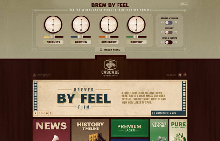
So, I am going to talk about all the awesomeness of this site because, truly it is a wonder to behold. In list form:
-The art is badass and there is so much of it! Every illustration is perfect for the content and has a light but technical feel about it.
-The structure is simple and fluid and perfectly suited to the art (or vice-versa, you know what I mean).
-The sheer volume of interactivity is incredibly engaging
-The control dash at the top makes me feel like I’m at the helm of a spaceship powered by tasty beers. ‘Engage hoppy lager thrusters for a twelve second burst, Ensign’
-The site is actually chalk-full of real content! Who would have thought. Often the content is overlooked in favor of flashy jQueryness and graphics but this site is a pitch-perfect synthesis of content and interactive enhancement.
In a lot of ways, cascadebreweryco.com.au feels more like a webapp than a site. Because you have so many ways of interacting with the information, it feels like you have almost total control over the site. This is incredibly effective in engaging the user. I probably spent ten minutes just fudging with the sliders to see what graphics would appear and disappear. The site branding is pretty amazing. They have employed many of the same beer related graphics as many other contemporary breweries and it still feels fresh and new and progressive. This site takes interactivity to a whole new level.
That being said, its slow. They are loading about 600 k with nearly two dozen script files. All told it loads about a 1 Meg with images and other assets, which isn’t too bad but, they are hitting the server pretty hard off the bat. Also, each other page takes some time to load as well. So much, in fact, that they needed to employ a custom loading spinner to bridge the wait time. And the spaceship style content filter takes a while to do its magic. At each step of the way we have a bit of waiting time. Its not too long but just long enough to be noticeable, especially after you’ve been on the site for a few minutes. My only other complaint is the auto collapse of the spaceship controls when your cursor gets down into the content.
I’m picking apart details here and I’m not trying to be negative. This site is gorgeous, progressive and functional. In most ways, its damn-near perfect. I dig it. But a couple of the details could be tweaked to improve the user’s experience.
Truly badass.


0 Comments