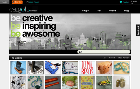
Pretty good design for so much content and imagery. I like the stark black and white base used in this design and they overall approach to the typography is nice as well. I’m not wild about the design of the drop-down navigation elements but that’s about it, the rest of the site pretty darn well done.


0 Comments