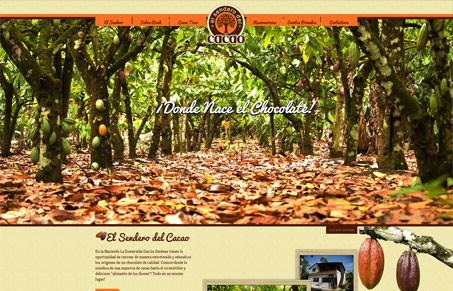
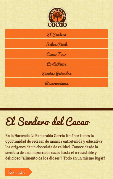
This site is actually kind of crazy. It’s looks cool and is a responsive design, I really love the smallest width version the best, super well done looking. The main image is oversized and there is a slight scrolling animation in the logo and tagline that sort of follows you down the page. In the end it’s kind of fun and looks to be in the spirit of ‘neat’. I can get behind that I think.


0 Comments