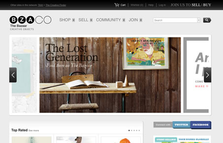
Bza.co is kind of like etsy for fine artist (not taking away from etsy, which is awesome). Its design is modular by necessity and that works pretty well overall, but the header feels a little disjointed and some of the links seem understated. The separation between content blocks in the body feels balanced and well structured but the whitespace between horizontal elements in the header is a little loose. ‘Nuff said about the header.
Bza has nice muted color and does the ‘get the hell out of the way of the content’ thing pretty darn well. Some great artwork calls this site home and bza does a good job of featuring it.


0 Comments