Submitted by Dan Spencer, Designer.
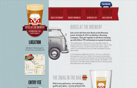
Aside from this looking like a hell of a lot of fun the site design is pretty nice. I like that it’s a single page type design with some unexpected interactions. The registration, directions and contact forms sections all “slide” out visually as you click on those sections and buttons. Very nicely executed IMHO. The overall design has a really nice sense of texture and coloring too, very classy looking – which lends itself well to selling the event. Good stuff.


Thanks for the post! I had a lot of fun designing this site.