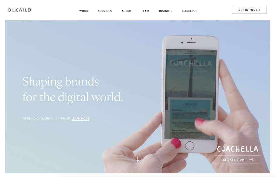
Pretty slick visual design. I love the light vibe to the colors/contrast and typography work. I have to say the interstitials kind of get annoying after a while, but I get why they’re there. All in all this is a beautifully designed website.


The Call to Action, Revisited
The Call to Action hasn’t changed in a decade, but the bar has. A fresh look at prominence, copy, mobile tap targets, and accessibility, with lessons from three major design systems.


Great website! It loads really fast with smooth animations and transitions. I loved the way that they tell who they are. The typography could be a little bit more refined with the sizes and weights. ????