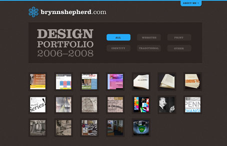
Great looking portfolio site design. It’s really simple and to the point. Love that brown color for the background with the subtle texture. I like that it’s mainly a portfolio and that you can simplify the view to a specific medium of design that she does. I’m not wild about the slide-out header/about section, but somehow it works for this site. The detail pages of the portfolio are well done, I like that I get a large screen shot of the work with a little description of the service provided.
(Note: yeah, this is a re-post, sorry in advance for the un-original posting guys… need more cofee…)


0 Comments