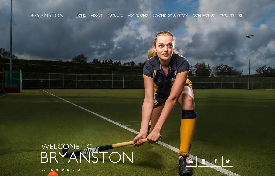
Great images permeate throughout this site for Bryanston School in the SouthWest UK – which is really good. I think the most interesting decision they made of the site was maybe for accessibility – there’s a link in the footer to see the “High Visibility Version” of the site – that is a black background with yellow and blue text, but the same hi-res photography. Check it out – in our web-world, that’s kind of trippy, but might also be useful? I’m not sure and would like to hear feedback (keeping in mind who their customer base could be – not just from a designer’s point of view).
( made by @e4education )


0 Comments