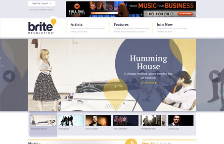
Super fun looking site here. I love the clean and simple nav at the top, and I tend to dig the carousels that show you a little something on either side of the active image. It’s a neat touch. The rest of the site has a sort of magazine layout. Everything is organized well, but each section stands out on its own. The little icons that tie back in with the logo are nice, but I think I’d like to see them carried through from the home page to their respective pages. Only having them on the home page makes them seem a bit superfluous. I like the use of gold and grey overall. It’s balanced well and lets the vibrancy of the images stand out.


0 Comments