Submitted by: Matt Reed @mcreed
Role: Designer & Developer
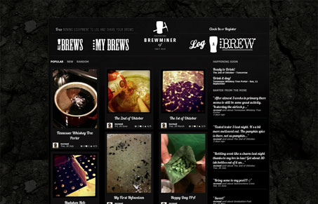
The inspiration came from a bottle of Jack, in more ways than one. Most of the homebrew sites are usually tan with browns and burnt oranges so the white on black seemed to be a nice departure color wise. The darkness of the mine seems to lend itself towards letting the brews themselves shine through without getting in the way too much.
I think Matt’s desire to make something different from other beer sites is definitely successful. The black and white works really well, especially with the main navigation, each of which almost work as logos themselves. I really like the script font used, but it’s a bit hard to read at smaller sizes. Also, it took me a bit to figure out exactly what the site does, which is serve as a place where homebrewers can create a page of sorts for a batch of beer they’re creating, and in the process, create a log from start to finish. This is a cool idea, but it’s not clear at all. Between the lingo (mining) and the lack of any description I’m afraid a lot of people might pass this up without signing up. Perhaps the mining metaphor is clear to homebrewers and I’m just not the target. If so, I’ll be glad to be wrong on that point.


I agree 100% with the review. Great look / feel to the site, but it’s not clear as to what they want me to do, or what in fact they do. Sign up? browse? drink beer?
In order for me to buy in I would need a clear “about” section. What this site is, what they’re goals are and how I can contribute as an amateur beer enthusiast.
That being said, not a bad for an amateur beer site, in fact one of the better ones I’ve seen.
I agree with both of you Jay & Isaac. The idea behind the site is a slow roll to understand indeed. Very nice design though, like you said.