
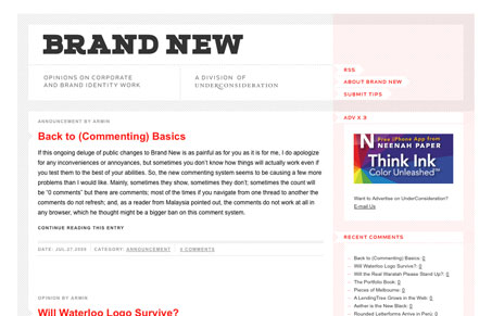
It’s the new(ish) Brand New, from our friend Armin Vit who was gracious enough to do an interview with us a wile back.. This is one of the better design resources on the web IMHO. I love the simplicity of it, and the pattern used in the “padding” space in between the content blocks is a nice touch, it really breaks it up and makes it feel more complicated than it really is. Of course even though it’s quite a simple layout, the typography is outstanding. I just really like looking at this site.


Fitts’s Law: Why the Easy Button Wins
Large, close targets are faster to hit than small, distant ones, that’s Fitts’s Law. A look at the 1954 rule behind buttons, prime and magic pixels, thumb zones, and dark patterns.


0 Comments