Aside from looking like an incredible conference featuring some of the long time leaders in graphic design thinking, this is a really beautiful looking website design. I love the colors and large bold type treatment. The blocky mixed with the thin line type is just wonderful. Then having the speakers’ pictures inside the type gives it much needed depth. It is just a straightforward simply executed website but nonetheless I love it.


Brand New is one of my favorite blogs and that makes me really want to like this site, but alas, I can’t. It has so many problems that frustrate me and do nothing but seem to elevate style over function.
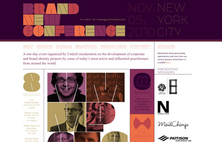
Before I talk about a few of those things, I do love the logo and the overall color palette. This really does look like an exciting conference.
The date and location text on the top right in the header is set in such an extreme light weight as to make it very hard to read, and makes what would probably be a smooth font at even larger sizes, very pixelated.
The rendering of the font for the navigation is just slightly blurry, and at first I chalked it up to web font rendering. But it turns out they’re images, which, with all the options at our disposal these days, is really unfortunate. So what should be a really nice font, at this weight and on the screen, just turns kinda ugly to a point that wasn’t event able to be fixed as an image. This is why it’s important to try to pick fonts that work well on the web at multiple sizes.
Gene liked the speakers photos inside the letters but I don’t really get it. They’re letters, so I was trying to scan down and make a word of it, until I figured out that it’s the first letter of their name. This strikes me as a meaningless effect that does nothing to confuse things. If feel like if I’m trying to find meaning in something that has no meaning, then maybe it’s better to use a simpler treatment. What would be wrong with the same colors but just blocks? That would go with the geometric layout of the site and be clearer.
Scroll down from that area and.. hello white space. This is not the type of white space that people talk about reverently. this is the type that comes about when people fail to plan or design for the amount of content they have, or fail to plan for what happens when they have more than expected. It’s as i the area with the speakers was designed more like a poster and less like a part of a website. It’s mostly nice, but when put in context it contributes to a feeling of being incomplete.
Lastly, the speakers page has a well-structured, easy to scan layout but they’ve chosen to hide the bios with rollovers. I can take or leave this choice, it’s not always wrong or right, but in this case they’ve dedicated two lines for the instructions on how to use it: “Roll over to reveal. Roll off to hide”. If, as a designer or developer, you feel the need to include that kind of instruction just to see basic information, maybe think about a different approach. On top of that, once you do rollover, you’re likely to have to scroll up or down to get the browser window in exactly the right spot to be able to actually read the whole bio. And don’t click on it, it will take you to the top of the page, since a basic ‘return: false;’ wasn’t added to the rollovers.
I hope this doesn’t seem to harsh, but it’s a shame when an entity like Brand New, which is all about details and execution when it comes to brands and type makes a site sorely lacking in some of those same things.