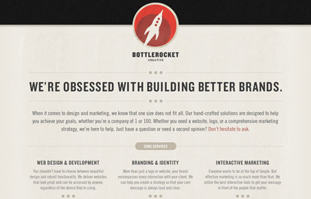
bottlerocketcreative.com embraces the minimal. In design, information and interaction and has removed all the chaff and left the bare essentials to make a complete face for their service. The design is simplistic to the extreme, though what it lacks in a distinct personality it makes up for with a clean and well ordered structure, and an iconic retro logo. Some of the design patterns could have been repeated for the sake of consistency and logic as well as to provide a little more information. For instance, the three columns of the gallery section each pull up a light-box for viewing a higher resolution picture of their design. This could be repeated in the core services section. Each caption and header feel like they should link to a page with more information about that particular service. In this way, there would exist a more consistent user interaction without changing the design. bottlerocketcreative.com is a pretty site, it has some nice CSS3 effects, but in some regards it feels more like a newsletter than a site.


Giovanni,
Thanks for reviewing my site. I really do appreciate the feedback. It is currently just a landing page and I am working on building out the rest of the site with more info on the services we offer, case studies, etc. So, eventually users will be able to get more detail. Hopefully once it’s completed, it will lose some of that “newsletter-ish” quality.
Thanks gain.
Adam
Can’t wait to see the full website Adam, keep us posted when you launch it!