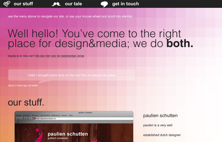
Really interesting layout. I like the long page and the changing color spectrum background. I do think the fact that the page is long instead of being multiple pages can be problematic, shown by the need to have directions at the top of this page, i’m not 100% sure if it’s intuitive yet to most users. It’s pulled off nicely on this site, since the color shifting background makes you want to scroll naturally so you don’t really need the nav links. Great looking site visually.
I’m not sure of the difference in design vs. media. Maybe visual layout vs. video or something, the copy on the site is a bit lacking in fully playing that up to me. I’m not sure how big of an issue that is though.


0 Comments