
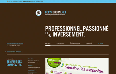
Nice clean well organized layout, reminds me of the swiss school of design. This style of layout isn’t anything new by far, I just happen to like this one and the twist it has with the dark brown background and light blue color used for highlighting certain elements and copy.




Always loved light blues mixed with dark brown colors on websites, very lovely nice work.