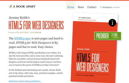
Very simple website, but there’s a lot of great stuff going on here. There’s some really great visual hierarchy with the type layout in the left column, from large to small as the copy gets less important and more involved to read. The copy is also top-notch and really gets to the point of why the book is worth the buy. Then the call to action is that green button/box placed on top of the large image of the book. Making it green is also brilliant in that there’s no other color like it on the page really. Really really great page design here.
Looking Fast: The Art of Website Speed Perception
In the web world, technical speed and user perception matter. By improving design for a faster appearance, you boost conversions and stand out online. Speed isn’t just loading time; it’s perception.


Everything these guys do is of course always so simple and well thought out. Everything that you need is there without all the junk. I really enjoyed the “quick questions” area to the left of the contact page. It’s almost relaxing to navigate this site. Can’t wait to get the book!
On another note, I actually got upset when I had to go to paypal – yuck.