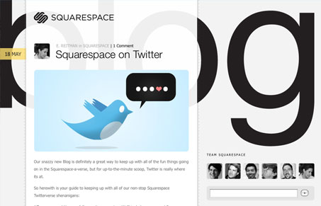
Nice minimal blog design, there’s not a lot going on in the design but there are however nice little details. The ruler marks and the slight transparency beside the blog post dates are subtle and nice. My one nit-picky thing is the icons for the authors, I know one or two of them by their face but that’s just me, a nice rollover or tool-tip thing would be cool to show me their names. Overall though, this is a nice, simple, clean blog design.
Glassmorphism: The Transparent Design Trend That Refuses to Fade
Glassmorphism brings transparency, depth, and light back into modern UI. Learn how this “frosted glass” design trend enhances hierarchy, focus, and atmosphere, plus how to implement it in CSS responsibly.


0 Comments