blinksale.com

blinksalecom

It was time for blinksale to get a face lift, it’s also really great to see this app go to a new home that truly loves it.

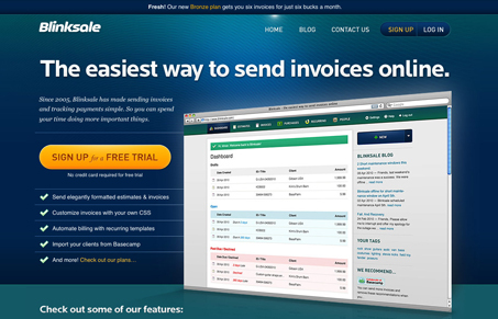
For this design I really love the clean clear call to action in the large(ish) orange button placed right beside the big screen shot of the app. The check boxes below the call to action are also very well placed and written. I especially like the concept of getting me signed up and telling me to worry about being billed in 30 days, that’s smart and lowers the risk for me to check out the app. Great stuff here!

They’ve spent a great deal of time inside the app too, sort of re-aligning the design and not truly starting over. Very smart move and very good stuff, if you’re game sign up and check it out in person. Or you can read their great blog post on the design effort here.

0 Comments

Submit a Comment

Your email address will not be published. Required fields are marked *

News & Articles

Looking Fast: The Art of Website Speed Perception

Looking Fast: The Art of Website Speed Perception

In the web world, technical speed and user perception matter. By improving design for a faster appearance, you boost conversions and stand out online. Speed isn’t just loading time; it’s perception.

Designing for Errors: Creating User-Friendly Contingency Plans

Designing for Errors: Creating User-Friendly Contingency Plans

Contingency Design hinges on empathy, understanding user frustration, and transforming errors into positive impressions. By embracing these principles, you enhance user experiences, retain customers, and boost revenue in the competitive digital landscap