This is a really cool design experiment using a non-fixed width site. Using some scripting (jQuery) to fix the site’s grid/width based on the browser width you are currently viewing the site at. It’s a really cool effect. The design of this site is also very nice, the grid layout used here somehow makes the images very scan-able even though there’s a lot of content on the home page. The sub pages begin to break down when you view this site on a wide screen monitor, parts of the layout just get disjointed and you can lose your place easily. Over all though, I find this site a very refreshing one to review.
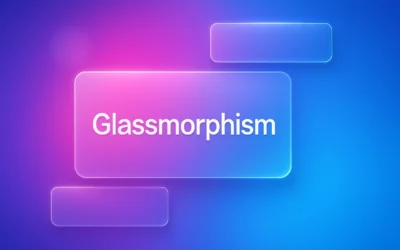
Glassmorphism: The Transparent Design Trend That Refuses to Fade
Glassmorphism brings transparency, depth, and light back into modern UI. Learn how this “frosted glass” design trend enhances hierarchy, focus, and atmosphere, plus how to implement it in CSS responsibly.


Only problem being, if you don’t have JS enabled the site just doesn’t work.
Yeah, some graceful degradation for users without javascript would be a really thorough touch. I get the feeling this site is largely an experiment in layout and javascript too.
Perhaps due credit should be given to http://cargocollective.com/suprb#17924 who developed the WordPress theme / jQuery this is built on.
Guys this is just another example of the Grid-a-licious theme by Suprb (http://cargocollective.com/suprb#17924) that many hundreds of sites now use…
http://typeneu.com/
http://reformrevolution.com/
It’s becoming a bit overused and hackneyed now…
@Dan @Simon Thanks for the insight on this, I’d never heard of that theme before. I think the review still holds, especially on the sub pages the theme begins to come apart in regards to the layout.