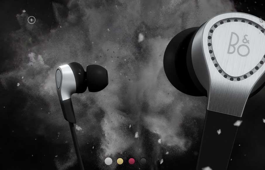
Beoplay’s H3 site site is truly beautiful. I’m often against the practice of hijacking the user’s ability to scroll, but the effect works really well on this site. Every ‘page’ is clean and minimal, but provides a very different user experience. The videos are lush and intimate, while the product photos are stark and ultra detailed. I must say that I’m most partial to the “cosmic parallax dust storm action photos” of the product.
Looking Fast: The Art of Website Speed Perception
In the web world, technical speed and user perception matter. By improving design for a faster appearance, you boost conversions and stand out online. Speed isn’t just loading time; it’s perception.


Hmmm. 20 seconds and counting for content to load on Broadband, and an immediate popup to take a survey. Maybe the design is great, but I bounced before I saw anything. There’s got to be a better way to balance good design with a quick-loading UI, and no popups.
@Josh
I agree that a balance is better in pretty much every circumstance, but I do think there is a place on the web for sites that push the envelope well beyond best practices. While the load time is pretty egregious (Ouch, 14.8MB), the dynamics of the page might be impossible otherwise.
That being said, your point is very well taken. Even great design can fall on it’s face if it’s non-functional. Thanks!
For me, it was the combination of the 20+ second load time AND the survey pop-up on page load that killed the whole experience. I certainly agree with pushing the design envelope – too bad that envelope requires a survey pop-up! 🙂