

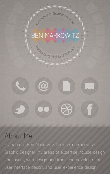
benmarkowitz.com is definitely nice to look at though its a little contrasty even on a clear monitor. Its a great variation on a primary triad color scheme and responsive to boot! But this site is an undeniably great example of what can be done with a little jQuery and CSS transformations. Its a also a great example for understanding how to create the illusion of depth with linear perspective. Very cool.




0 Comments