
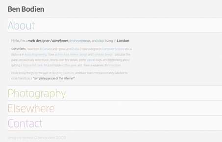
Pretty cool single page design, that gives a little more than just sliding the page down to a target anchor position. I like the opening and closing of the content areas, it almost feels unexpected the first time you click around. The thing that sells it for me is the movement is really smooth and just glides. It would be super cool to get some of the photos to actually load on this page, but overall this website design is pretty neat.




I like the simplicity of it’s organization but I feel like the design is too simple and washed out. It kind of hurts my eyes to look read the light gray text on stark white. : /