Submitted by JD Graffam, @jdgraffam. Designer & Developer.
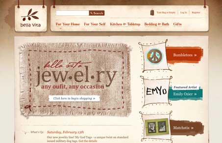
Some neat details in this design, the real world elements being pulled in are nice. I like the earthy colors and textures, really helps sell the mood of the products. It’s a nice treatment to a standard style shopping cart site with lots of products in it. Those are difficult to work out truly unique treatments with and this site is no exception there, but the tight attention to completeness and detail really make it nice. This site has a ton of content to navigate and it’s done is a really clean and simple way, any user should be able to easily glide around this store and not get lost. Great job!


0 Comments