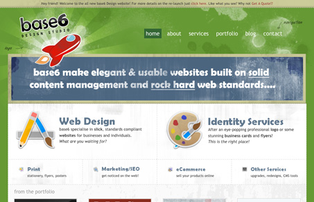
Nice textures and illustrations, nice layout and coloring. There’s not much about this site that isn’t good in a purely visual/presentation perspective. From a usability perspective, it’s certainly nothing major, but I do feel like there isn’t a really clear call to action (this isn’t just base6design.com stuff.) There are a lot of elements in play on the page, my natural inclination on a portfolio/design firm type website is to click on work samples, this site has plenty of stuff for you to click on. I’m just left feeling a bit lost after those portfolio pieces as a point of hierarchy as to what to click on next.
Glassmorphism: The Transparent Design Trend That Refuses to Fade
Glassmorphism brings transparency, depth, and light back into modern UI. Learn how this “frosted glass” design trend enhances hierarchy, focus, and atmosphere, plus how to implement it in CSS responsibly.


Props for working the term “Rock Hard” into your header.
The icons on this site are property of David Lanham and IconFactory.com. I’m pretty sure they’re only licensed for personal use and not on a commercial design studio site.
Also, I count about 1/2 dozen or so ripped off icons: Transmit, System Preferences, Numbers, Dropbox… yikes. Do you suppose he thought no one would notice?
Oh, I see. Each of those are from the Iconfactory Sticker Set. Still, john’s right, those aren’t licensed for commercial use.