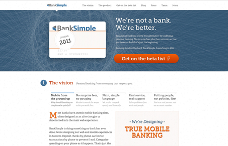
Really beautifully simple site. I love the way the site is arranged, the single page works really well here. The fixed header/nav keeps you visually informed of where you are quite nicely and subtly. It’s also very cool to see many of the details being created with CSS, like most of the shapes and event looks like the credit card is done this way too. So cool! The details are just the right amount of crispness and tightness to give it a very trustworthy feel while at the same time looking very modern web wise. I love that contact/beta invite form too, very well done. The design is responsive too, reduce your browser window’s width to check it out. Very very nice!
Microinteractions
Microinteractions are subtle site animations enhancing engagement. They include triggers, rules, feedback, and sometimes loops/modes. Practical uses: improving engagement, guiding user behavior. Well-designed microinteractions boost user engagement and your online presence.


The site is a MESS and is mostly unusable if accessed without JavaScript and I consider this as highly unprofessional. What do the nicest design details matter if the most basic functionality isn’t working? And even worse is that it’s not even a website about new, rich, interactive media or a web application, it’s a “simple” bank website (no pun intended but it’s kind of ironic). Do they want to lose clients because their agency or whatever can’t do the job properly?
I dunno, i’m hearing more and more that this really isn’t an issue. Like something like this report for example.