
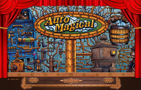
This site is just crazy. It’s incredibly simple in what it does, and clearly the illustration is what drives it. But, man it’s awesome… I love illustration like this, and I really love it when it’s used to totally make a concept cool. It’s a splash page for mailchimp’s automagical service, so the site is fairly one dimensional in what in needs to do, but they’ve created a genuinely interesting and creative concept to drive you to the mail site to convert. Brilliant!




0 Comments