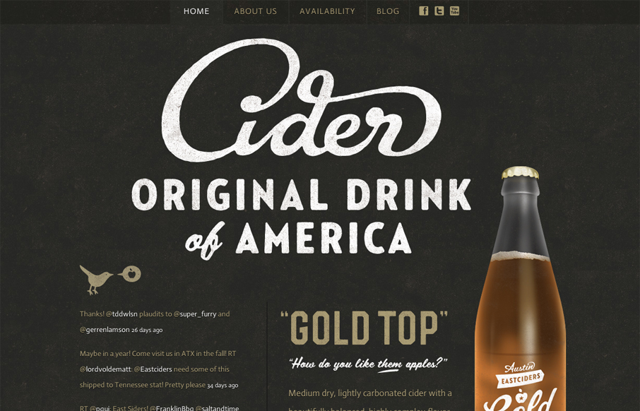
I love this site’s mix of aged, textured fonts and simple structure. The combination of these two elements works really well with the photograph of the cider bottle. The golds and off whites work well with the black background, as well, though the text is a little too small and low contrast.
That is a beautiful script of the word “Cider”. Love it.


I love the feel of this site. It perfectly evokes the ‘old sign on the side of a building’ thing. And the script type is just beautifully done.
Impressive typography and layout. Couple of things that didn’t sit right with me though: the bottle does not blend in well with the content as an image and looks kinda “fake”. There is also basically no interactivity, something I have grown to expect from web these days.
For me, the site doesn’t seem to be designed for interaction. The bottle has a hover state and links off to youtube. Everything else is pretty much just text links that link off to other pieces of content. It’s just a public facing marketing and information site. And a mighty pretty one at that!
I don’t disagree about the bottle; it looks artificial. Still, it doesn’t bother me that much. I like the detail.
Good thoughts, though. Thanks for the comments, definitely worth mentioning.