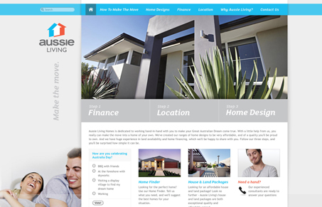
There are some really interesting interactions in this design. The way the three main sections under the slideshow area work is cool looking when you discover it. Then when you goto a sub page there is a slide out set of three buttons that let you get the main three conceptual aspects of the site at all times. The subpages are all very nicely executed visually, they all look like they’ve had time spent on them by a designer and that’s really nice.
One thing that’s not really hitting home is that there is a picture of a person on just about every page and on specific pages there is a larger picture of the same person – I can’t tell if this is the person behind the company or if it’s just stock photography. Naming him or calling it out in a more personal way would help concrete that idea more to me I think.
There is also a TON of interaction built into this site, check out the home finder page for example. The sliders and other icons really make you want to play around with the forms on the site as a user. That’s a nice touch.


0 Comments