
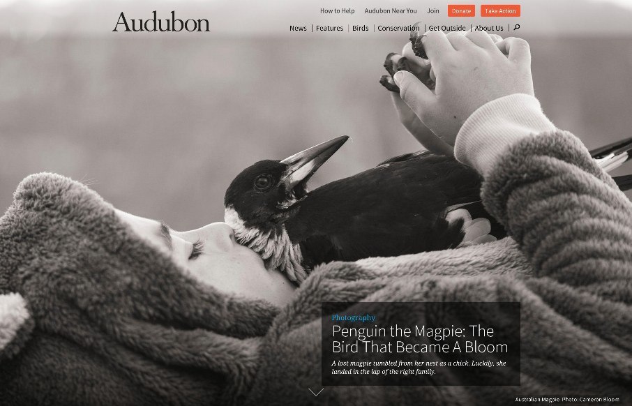
A beautifully executed website for Audubon. I love how the first thing you see is kind of like a splash screen, with a large image but still visible navigation, then as you scroll it slides up to reveal a more traditional feeling site. Then the site is not very “traditional” at all. Long blocks of content and plenty of scrolling to get you where you want to go. I also really like the way the detail pages for each bird utilize a super large background image, almost, then the content scrolls up on top of said image. Brilliant work here.


Fitts’s Law: Why the Easy Button Wins
Large, close targets are faster to hit than small, distant ones, that’s Fitts’s Law. A look at the 1954 rule behind buttons, prime and magic pixels, thumb zones, and dark patterns.


0 Comments