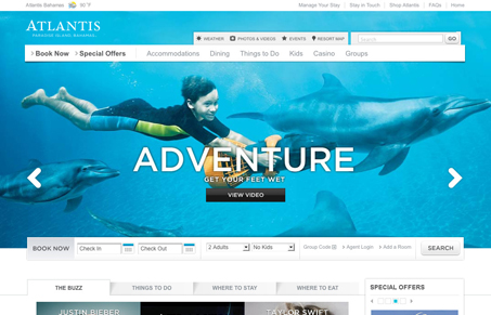
First things first, the portal page needs some attention. I understand keeping it quick but it doesn’t carry over the small design consistencies that the two sites share. I think it’s interesting that instead of trying to continue the large photo backgrounds on the homepage they have chosen to stop them just far enough out that most people won’t notice which I find acceptable but I could see bothering those with larger monitors.
The type treatment on top of all photos works fine except that they haven’t tried too hard to put it on a darker background and therefore it’s lost in many instances. Overall I get a cold feeling from this site which is obviously opposite from what people want from their vacation experience. It’s a very “corporate” site for a company that’s offering this kind of get away experience. Another thing that really tipped me off is the lack of content featuring local attractions, history, nature, culture.. but I guess it’s part of their strategy to keep people in the resort.


0 Comments