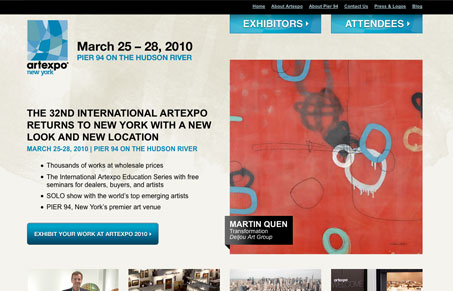
I really like the openness of this design, the way the text and columns are laid out in relation to the big main image. I also like how the drop-down navigation is worked into the top two main nav/badge elements. It’s just really clean and clear.
Glassmorphism: The Transparent Design Trend That Refuses to Fade
Glassmorphism brings transparency, depth, and light back into modern UI. Learn how this “frosted glass” design trend enhances hierarchy, focus, and atmosphere, plus how to implement it in CSS responsibly.


0 Comments