
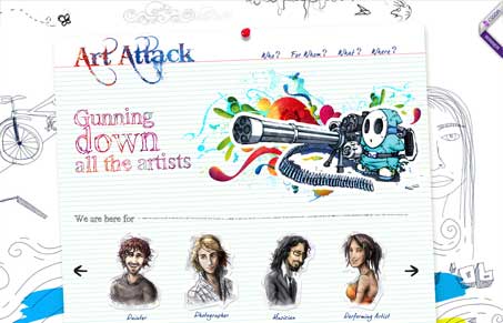
Really cool illustrations in this design. The main illustration of that little dude with the gatling-gun is crazy, but I love it. It’s really a fairly simple home page, but it’s made more visually complex by all the extra stuff on it. It’s also not really easy to figure out what the website is about, it takes a little digging to get to that. It’s visually interesting which keeps you interested long enough to get there though.




I don’t know who added this but I did not and I am not the designer nor the developer of this website. Someone is using my Twitter data?
Oh man, Thomas, that’s weird indeed! I’ll remove your info as submitter.
Someone definitely submitted the site as you though.
Thank you Gene 😉
pretty damn weird!