archfirm.com

archfirmcom

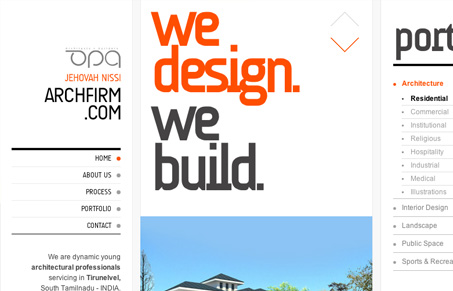
The navigation of this site was really enjoyable for me – although I’m questioning how wide it made the site in the end. The narrow content area in the center really works because it’s easy to scan through and the portfolio is always right there on the left for reference. They might have some translation problems in the content but all of the large key words and navigation are really straight forward which helped the general navigation and presentation.

I’d really like to know, what do you guys think about the layout of this site? Too crazy and wide or fun and fluid

0 Comments

Submit a Comment

Your email address will not be published. Required fields are marked *

News & Articles

Looking Fast: The Art of Website Speed Perception

Looking Fast: The Art of Website Speed Perception

In the web world, technical speed and user perception matter. By improving design for a faster appearance, you boost conversions and stand out online. Speed isn’t just loading time; it’s perception.

Designing for Errors: Creating User-Friendly Contingency Plans

Designing for Errors: Creating User-Friendly Contingency Plans

Contingency Design hinges on empathy, understanding user frustration, and transforming errors into positive impressions. By embracing these principles, you enhance user experiences, retain customers, and boost revenue in the competitive digital landscap