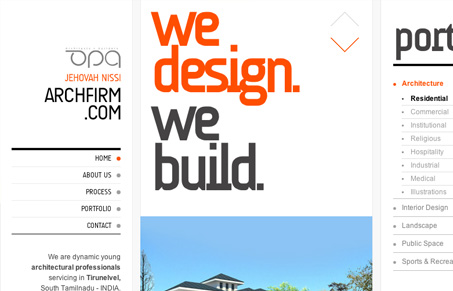
The navigation of this site was really enjoyable for me – although I’m questioning how wide it made the site in the end. The narrow content area in the center really works because it’s easy to scan through and the portfolio is always right there on the left for reference. They might have some translation problems in the content but all of the large key words and navigation are really straight forward which helped the general navigation and presentation.
I’d really like to know, what do you guys think about the layout of this site? Too crazy and wide or fun and fluid


0 Comments