Submitted by Frederik Declerck @fred_dec
Submitted it because he liked the site and Fred’s an awesome guy!
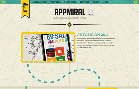
A beautiful 1-page website where the ‘crab’ leads you through the different parts of the website in an awesome, dynamic way. The navy theme is well chosen for this kind of company and is very well worked out here.
This is such a fun website! I love the animated crab that follows you down the page as you scroll – beautifully executed! There’s so much detail here that this site deserves 3-4 really long looks to take it all in really. My two favorite parts are the shark between services and about and then the main logo, that is how it goes to just the hat after you scroll past the first section. Beautiful site!


0 Comments