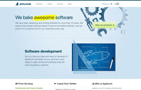
The Applicom site is a great example of a clean corporate looking design that has some flavor at the same time. The illustrations and bold copy make it just different feeling enough. It’s a simple design but has some character. I like that.
The Applicom site is a great example of a clean corporate looking design that has some flavor at the same time. The illustrations and bold copy make it just different feeling enough. It’s a simple design but has some character. I like that.

In the web world, technical speed and user perception matter. By improving design for a faster appearance, you boost conversions and stand out online. Speed isn’t just loading time; it’s perception.

Contingency Design hinges on empathy, understanding user frustration, and transforming errors into positive impressions. By embracing these principles, you enhance user experiences, retain customers, and boost revenue in the competitive digital landscap

Explore the advantages and considerations of fixed navigation design in web development. Enhance user experience and aesthetics while ensuring it serves a purpose in your design.
I like the design a lot, it’s pretty smooth. I didn’t realize the middle section was a slider. I would like to see some slider controls there… even if it is only 2 slides. It would help draw attention to the interaction and give the user an illusion of control.