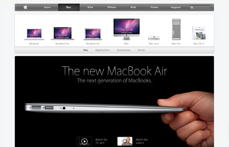
In our screen cast Giovanni and I talk about the newness/updates to apple.com. First off it’s not the overall website we’re interested in it’s the new interactions they’ve added. When you load the site the main navigation is darker and it “drops” into the site, then you see the product images “fling” in from the right and “fly” out when you choose a new product type.
I feel like it’s pretty over the top, web-bling (that’s right we’re calling it bling). But even though we kind of joke about it and think it’s too much, when you think about a standard user’s experience using the site, would they truly be impressed with it, would it really delight them? Overall I think it does add to the final production value of your experience with using apple.com. They have such a high standard for experience when using their products it should naturally flow to their website, I think it does in this case. Not sure where else something like this could actually fit in and be liked but i’m sure we’ll be seeing it pop up somewhere else on the web soon enough.


0 Comments